Anyway, feedback is, as always, very much appreciated.
Wednesday, 9 April 2008
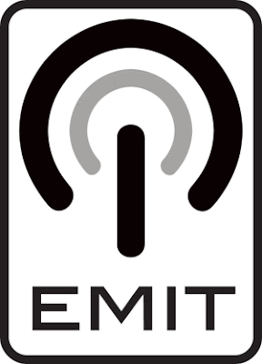
Logo idea
I've worked hard all day today; I even forgot to have lunch. Here is the fruit of my labour:
 I'm happy with the result. I've used my standby symbol idea to represent the electronic aspect of the music, but I've turned it on it's head to show the unconventional nature of the artists. I've then added another 3/4 circle to reflect the nature of the name 'emit'- almost as though the vertical line is an antenna and the circles are the signals emitting from it. I've enclosed the whole thing in a round-edged rectangle, which I think aids the eye in knowing where the logo begins... without this it looks as though the word 'emit' is just there underneath the graphic.
Anyway, feedback is, as always, very much appreciated.
Anyway, feedback is, as always, very much appreciated.
Subscribe to:
Post Comments (Atom)

11 comments:
Tom
I really like this idea. I think that this is the best one that I have seen of the group so far!
It does look a little like the WiFi logo but works really well.
You have taken note and made good use of all the feedback that you have been give.
--
Thanks
Shaun Bellis
It depends on the WiFi logo. I'm most familiar with this one. Which are you talking about?
I cannot lay my hands the one I am thinking of but this one is very close to it.
Forgetting lunch? Wow, you must have been working hard!!
Jokes aside, I think you have come up with a really strong logo here. You've got a strong weight and presence and definately a high level of contrast. Have you printed your logo out at different scales yet to see how it would look at smaller sizes?
Yup- it's easily visible at range of sizes, and is legible down to 1cm width. I need to decide what the smallest size should realistically be before moving on to the corporate style guide, though.
Craig (Burgess) reckons I should probably get rid of the outer border. What do you guys reckon?
Scrap it.....ha ha just a joke! Think you've got it in the bag Tom old boy.
Removing the outer border would allow the logo to become flow more easily into whatever it was placed onto. Keeping the border create a visual barrier. It depends whether you want the logo to remain slightly detached in its own right or not?
Really like this logo Tom and it meets all 4 principles really well but I do agree that the border should be removed.
I also think that semi-circle in the middle needs to be a bit darker because it could fade very easily on poor quality paper or by being faxed.
I've already made the inner circle bolder. I've also decided to keep the border, as when adding colour I've made the entire backdrop shape one colour, with the graphic and 'emit' in a different colour. I'll probably upload the idea tomorrow.
Very nice logo Tom, you’ve developed it really well and I bet you think was worth missing lunch over!
I’m not sure what else I can suggest, as I was going to say remove the boarder, but it sounds like it will work with one in colour.
Looking forward to see the next developed design.
Colour logo now posted if you would check it out and comment.
Thanks.
Your logo is really good. I think that its very key catching and would be a great logo design for the company Emit.
Post a Comment