 This week has been pretty productive as a whole!
A3 isn't as far on as it technically should have been- I'm currently gathering some feedback on the screen designs and developing my assets list- hopefully it should be finished by the end of this week, and the budget statement should also be done, if not well on it's way.
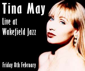
In terms of A4, I have finished the Image Restoration task, and have got a lot further on in my Banner Ads than I thought I would, mainly due to the intense design session we had this morning, in which we generated 40 ideas in 30 minutes! I found this task quite vigorous, but at the same time fulfilling- it was good to succeed at something I didn't feel confident with.
These ideas were then developed over the rest of the morning, and then this afternoon I managed to get them digitised! Please offer any feedback or constructive criticism on the designs.

This week brings sad news, with the departure of our colleague Tom Wealthy. It came as a big surprise to me when I found out he was leaving, and I was sad to hear it. However, it may be something we have to get used to as we get further into the course.
As I haven't posted it yet, I also feel it's about time I showed off my Image Restoration and got some feedback on that as well! I've been a bit behind on the gathering feedback side of things thus far, and want to change that before we hand in the assignment- a necessity if I want to achieve the much sought after 'merit' grade.
Before

After


4 comments:
I think that Tuesdays exercise was another useful demonstration of just how much work can be done in such a small amount of time.
Always as gaining feedback it is important that you record it and show how you have applied to your work.
This is something I need to start doing as previously I have just made the changes to my work without any reference to the feedback and this has effected my ability to demonstrate the development of my ideas.
Your photo restoration piece is a real good effort, you've done really well with it i'm quite impressed. Only thing, maybe look at the top right corner, where the tear used to be.. try blend that in abit more, but apart from that.. real nice.
I like your skyscraper alot too, really feeling the font you've used and the overall effect you've created with the banner. The title text hits you in the face as it's the first thing presented, then you follow down to the women and then the information text, very nice effort.
It is obvious how much effort has gone into all of your work that has been posted.
The photographs look good, I know how much time you spent on them and how frustrated you were with the colour but I think they look great! The only thing I would look at is the eyes of the right hand man. They look rather sharp and in your face (rather like your photo's).
Well done on the banner adds, they look really good! Nice use of contrast. I like the way you have aligned the photographs, it kind of makes it look professional.
I certainaly wouldn't be annoyed about seeing those on a website!
Comment deadline.
Post a Comment